Writing gives the impression of things. Conversely, things can give the impression of writing.
Typography is the form and structure into which words are manifested into our world. It has a long and storied history, and it’s our job to both understand this history and how to apply type effectively.
A brief history of typography
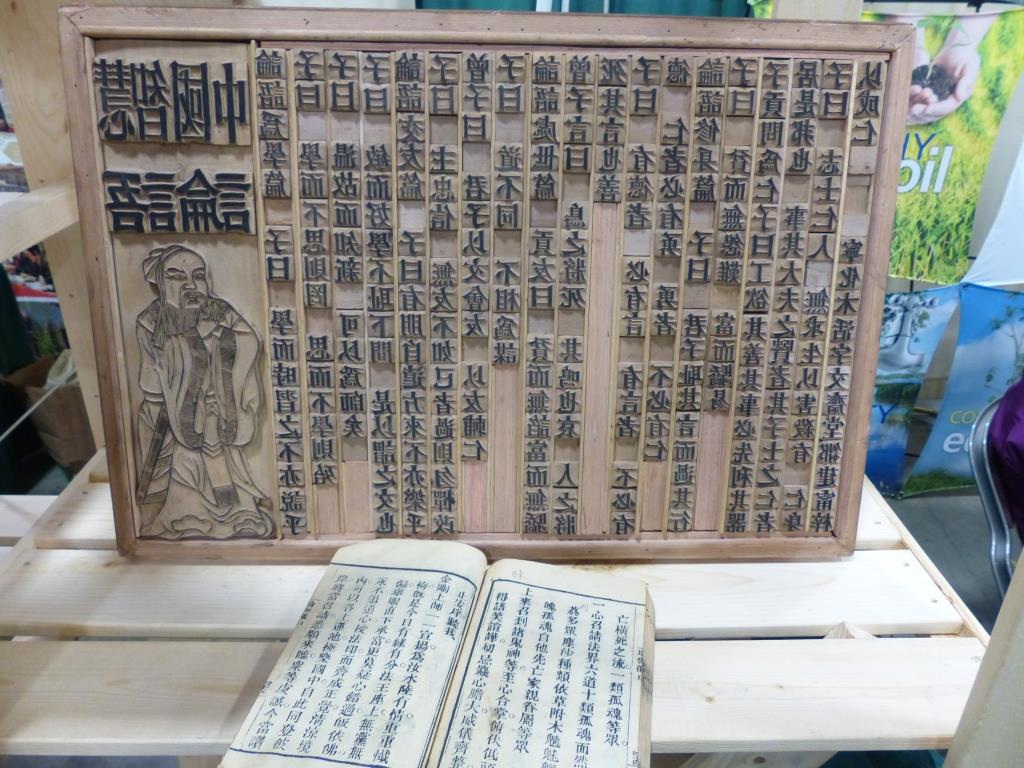
While Johannes Gutenberg is widely associated with inventing the printing press and movable typography in 1450, earlier forms had been invented around 1040 in Asia, by Chinese polymath Bi Sheng.
Our story here however begins in the early 1500s with Albrecht Dürer, a seminal figure of the German Renaissance. Dürer made the first inroads towards a methodology of type design, the beginnings of formal typography.
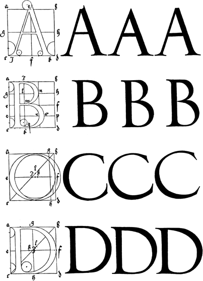
Dürer examined Roman letterforms and attempted to create a rational system for recreating glyphs, specifically drawing attention to the form in which words appear. At the time, the way words appeared were often a byproduct of the medium that was used to write them.

The first typefaces
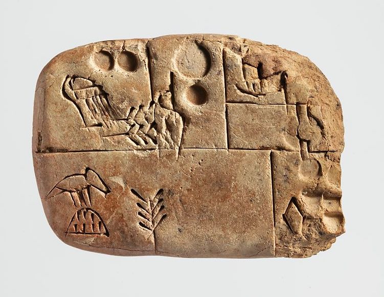
The first “typefaces” weren’t typefaces at all. Early writing was used primarily as a means for recording and storing information. Care was generally not given to the presentation of forms on physical medium, but to the information as such.
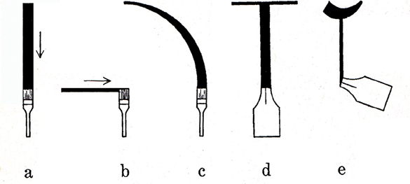
Often, words and forms were expressed into a particular physical medium with whatever tools were available. These tools shaped the ways words were shown and presented.
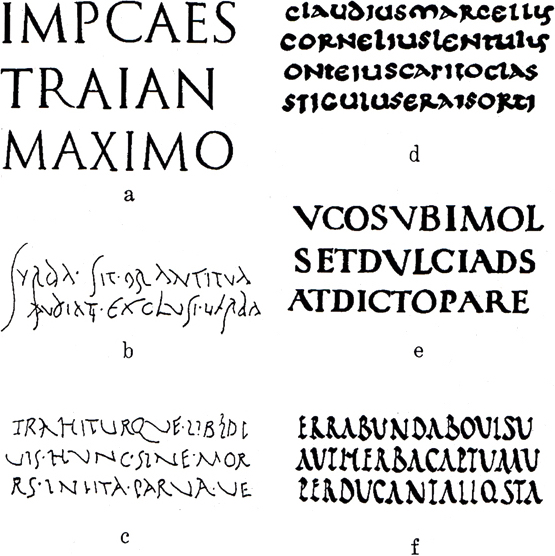
Metal type
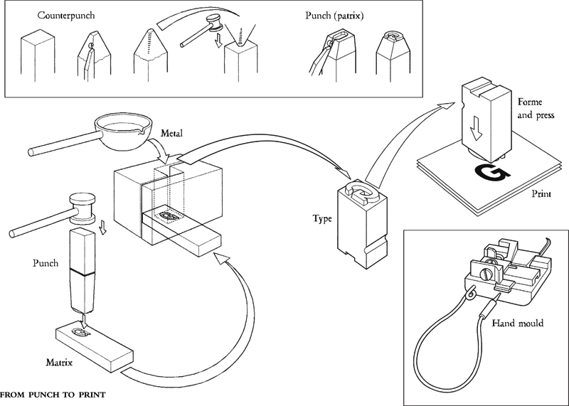
The first typefaces created with movable type attempted to emulate handwritten scripts. A typeface designer would create a punch which would function as the source from which a metal form would be created.
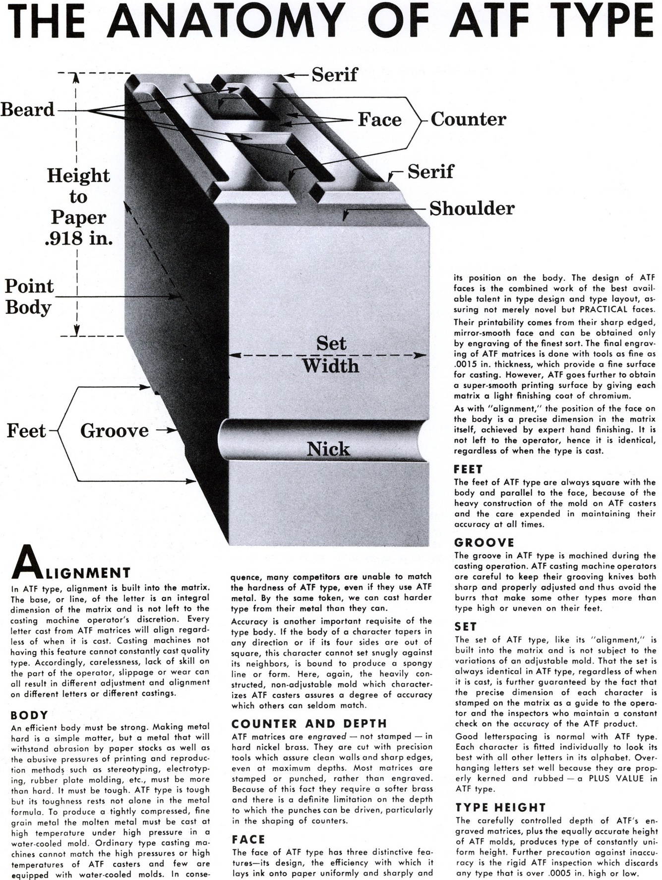
Many of the terms that were created to describe physical attributes of metal type (leading, point size, shoulder) continue through to our digital world.
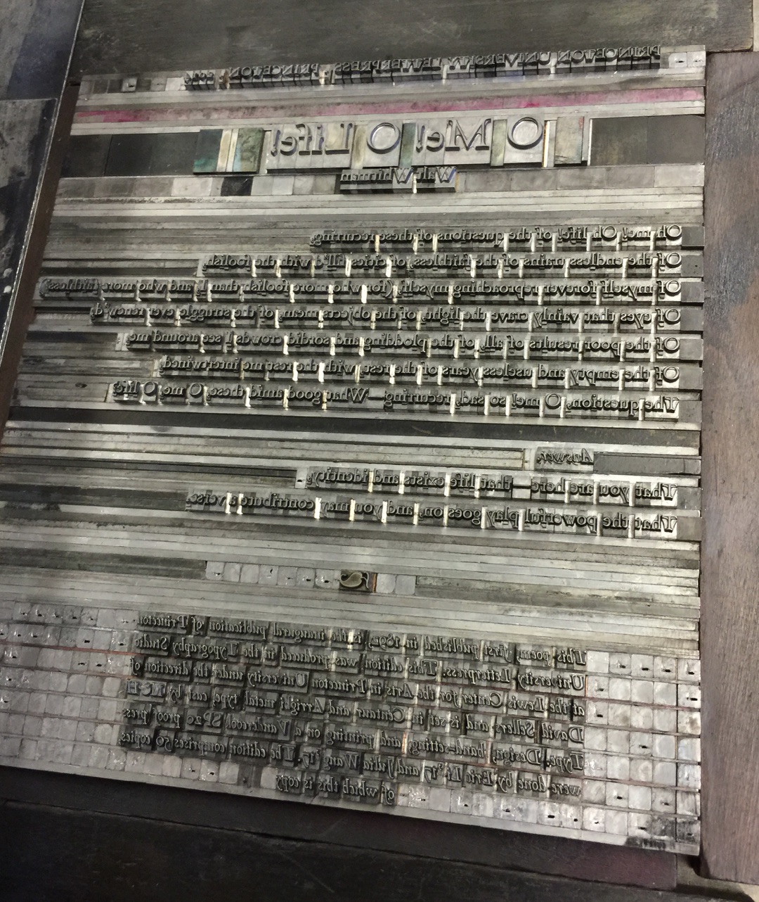
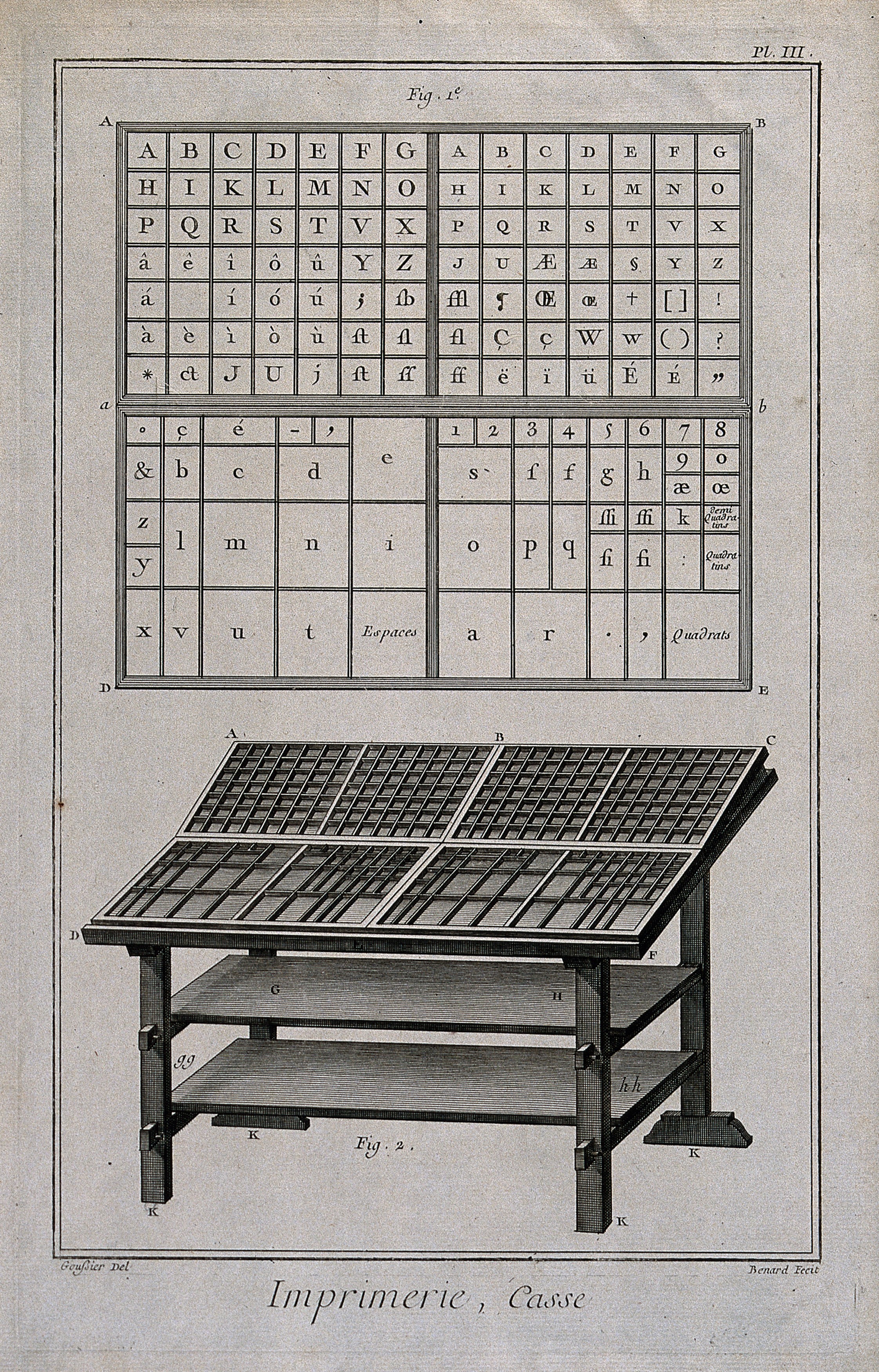
Type was stored in drawers where the lower case held the uncapitalized forms, and the upper case held the capital forms. Sound familiar?
Technological evolution
Over time, as technologies evolved, type and typesetting transitioned as well. We moved from hand setting movable type in composing sticks to Linotype typesetting. This allowed for machines to create an entire line-of-type as a metal slug, which could then be put into layout.
With the advent of the photocopier, we quickly moved from metal type to phototypesetting.
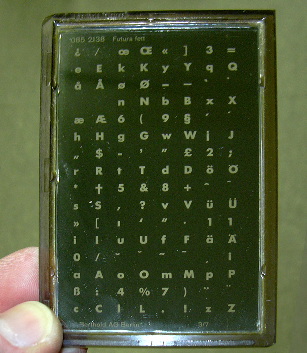
A phototypesetting machine works by projecting text onto a light-sensitive medium—film in some models, photosensitive paper in others—which is then used to transfer the material for offset printing. […] But because film was exposed one full frame at a time, the limiting factor with these devices was the size of the CRT screen, which kept the maximum page size down to about 8.5″ × 11″.
In fact, some of the first computer programs for digital typesetting, such as troff, were created to support and drive phototypesetting processes.
A transition to digital
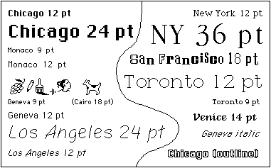
By the early 1980s, as the internet was being formed and the web had yet to exist, the advent of computers with screens and visual interfaces made the final typesetting transition: from physical to digital. Most significantly, the Apple Macintosh and Lisa were significant milestones in providing the first visual document editing experience on a computer. The term, What You See Is What You Get (WYSIWYG) begins with this era of computing.
To support this, in 1983, Susan Kare created a suite of digital-only typefaces.

With the transition to digital screens, the representation of fonts also evolved over time. Today, almost all digital fonts are presented as vectors—the basic mathematical instructions for recreating the letterforms.

However, while vector files are infinitely scalable, the medium on which they are shown (screens) are not. As with any analog to digital process, there is some loss of information as a computer samples the original shape of a glyph and then maps it to a pixel grid. This is how we get artifacts such as aliasing, which happens when a line or curve doesn’t land perfectly on the pixel grid. The operating system and display use shades of gray to trick our eyes into seeing a smooth curve.
So what is a typeface?
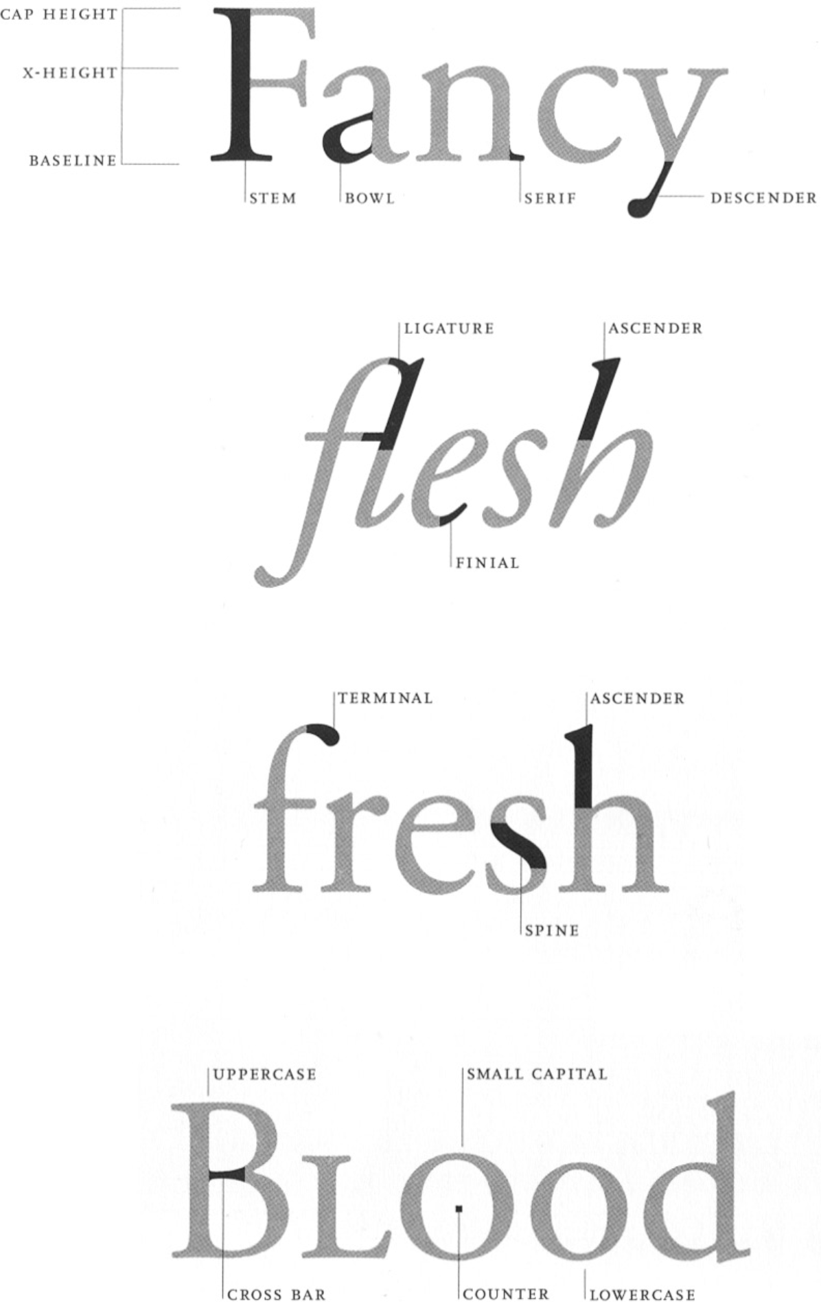
A typeface has distinct characteristics and properties that make it unique from other typefaces. Beyond the visual manifestation of each glyph, typefaces contain metrics that aren’t visible, such as kerning.
What is the difference between a typeface and a font?
Typeface is a font family — a collection of fonts based on the same design. The term font is mostly used for a single style such as EB Garamond Regular.
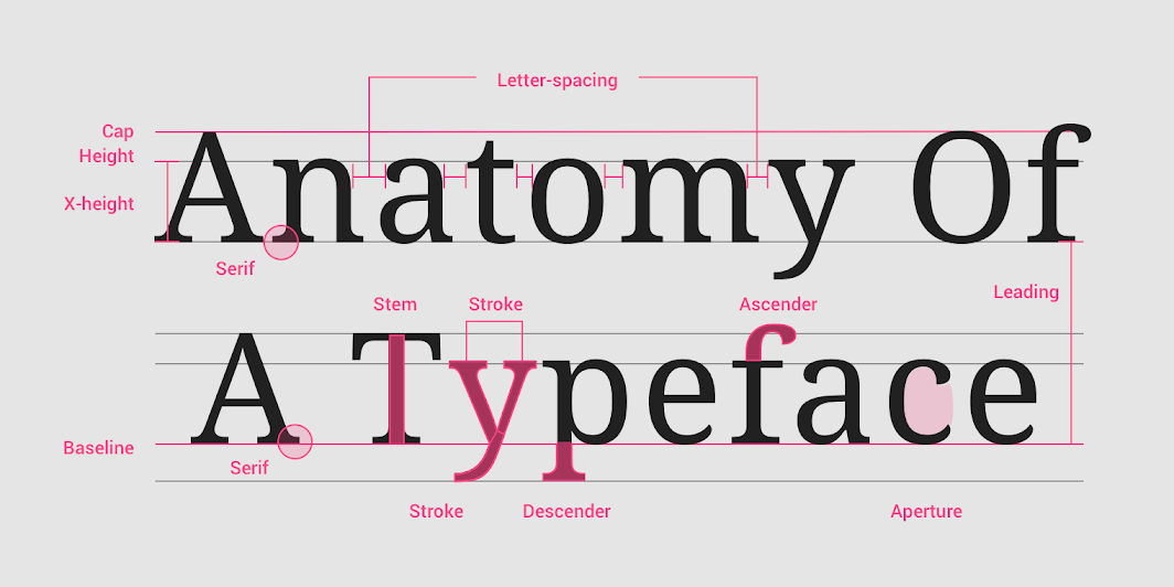
Broadly, we’ll refer to several main styles of typefaces:
- Serifs: have small lines attached to the ends of letters (like this site)
- Sans serifs: without these lines (how modern)
- Monospace: all characters the same width (as in code)
- Decorative: everything else (be careful)
While there are distinct subfamilies within each of these, our selection of a typeface from one of these particular styles already conveys significant meaning.
What are things to consider when picking a typeface?
- Readability
- Legibility
- Meaning
- Historical context
- Past usage
- Visual appearance (“vibe”)
- Licensing/rights
- Because it works.
- Because you like its history.
- Because you like its name.
- Because of who designed it.
- Because it was there.
- Because they made you.
- Because it reminds you of something.
- Because it’s beautiful.
- Because it’s ugly.
- Because it’s boring.
- Because it’s special.
- Because you believe in it.
- Because you can’t not.
Michael Bierut, on picking a typeface
Typesetting and layout
Type size, weight, and color
A heading (or display text) should appear differently than body text (also called body copy), which should appear differently than lists, which should appear differently than links, and so on. A well-typeset document considers all of these elements, working together, to create a clear, cohesive layout.
As you typeset it is also important to treat things consistently—headings should always look the same, so that a reader will understand what they are looking at visually.
We can use differing type sizes to distinguish between headings and body text. Generally, we aim to create a visual type hierarchy where the most important parts of a document have the largest size (headings), scaling down through our main, body text to the least important (captions or footnotes) as the smallest.
But the literal size is not our only tool. Another way we can distinguish copy within a document is by making use of weights—varying the thickness of the stroke. Good typefaces usually come in a range of weights to facilitate our designs—at the very least a regular (or roman), bold, and italic weight. Nowadays, variable typefaces allow us to pick and choose the exact weight combinations that we need.
We can also use color as a visual element to distinguish our content. Above, we keep the type the same in both the heading and body text. But using only color, we are still able to set the heading apart.
Many of these principles of hierarchy are come from the Principles of Gestalt—creating associations out of form. These principles have become systematized in interactive work.
Leading
Leading refers to the the space between lines, harkening back to the days of moveable type when metal separated rows. Body text should have looser leading since it will be smaller; heading text can be tighter without losing legibility, since it will be set at a larger size. We can tolerate close lines for short texts; we struggle with them over longer passages. The space between heading and body text should also be considered.
Ragging
Ragging is the in-and-out flow of text on the right edge in a left-aligned block of text. (Or the left, in a right-to-left script.) When setting type with a ragged edge (the norm in interactive, where justification is rare), pay attention to where each line ends.
A good rag is one where the lines move in and out in small increments. A not-so-good rag bounces the eye back and forth from line to line, creating distracting white spaces in the margin and hurting readability.
To avoid bad rags, we can make sure that the type size of a container is not too large and that the column is not too narrow. We want our text to land in nice rectangular and rounded, chunky blocks.
Widows and orphans
Widows are short last lines of a paragraph, usually one word on its own or the end of a hyphenated word. Widows generally leave too much white space at the end of a line, making it look like an extra blank line—disrupting your typographic rhythm and spacing. The wider the line and the tighter the paragraph spacing, the more distracting the widow.
Orphans are short top lines of a page or column—abandoned on their own—that are also distracting. They create ambiguous design intention and hinder clear reading.
We should avoid orphans and widows through proper ragging, making sure that type sizes aren’t too large for a container, and making use of the non-breaking space character, which makes sure there is not a line-break between two words.
We should also always wrap some words together (for example, September 6, or van Zanten), for ease of reading.
Punctuation
It is also our job to make sure that we properly use punctuation—so it is in service of our content, not a distraction.
Various dashes are a very common mistake. Hyphens (-) are different than
Another common mistake is misusing apostrophes and quotations. By default, most computers will generate (") as a proper curly quote when you type it (the feature is usually called “smart quotes”). However, you should be prudent to use opening and closing quotes—note the difference between these two quotes:
"These are sad, ambiguous, straight quotes."
“These are better, clearer, opening/closing quotes.”
A third mistake is to use characters rather than mathematical symbols. This common practice started when typewriters where the norm which only had a limited characters set. This excuse no longer applies! For example:
9 x 5 → 9 × 5
9 / 5 → 9 ÷ 5
9 - 5 → 9 − 5
When in doubt, The Elements of Typographic Style probably has the answers you need. It is among the best single references for typographic minutia.
Type foundries
Where does one find typefaces? From foundries, again referencing the days when making type involved casting actual metal.
While most computers now come with some good ones, there are many other places to get fonts. Here are some that we like:
- Colophon
- Comercial Type
- Dinamo
- Forgotten Shapes
- Grilli Type
- Indian Type Foundry
- Klim
- Lineto
- MCKL
- Order
- Typotheque
While not a type foundry itself, we include (and will use) this resource because of its vast array
Shout-out to instructor-emiritus Eric on this one.